PHOTOS
First Trimester
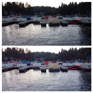
The bottom picture was the one I edited. I increased the brightness so the image was more clear and I also increased the saturation which helped all the boat cover colors stood out more.
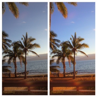
For this picture, I clarified the picture, on the right, since I took it in the car so it was a bit blurry. I also put a filter on it so it looked like the colors stood out more. I personally really like this picture since it was taken in Hawaii, and it makes me very happy to be reminded of such a beautiful place.
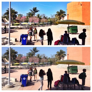
I edited the top picture by increasing the saturation, which really brought out the color of the MPR and the flowers in the trees across the quad. I also increased the contrast so the colors popped more. I really like color and I think that really showed in most of my photographs.
Second Trimester
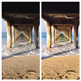
This is one of my favorites since it captures the beauty of where we live. I increased the clarity of the picture, on the right, so you could really see the different blues and greens in the water. I also increased the brightness since the picture was taken under the pier. I also appreciate this picture since it has a calming effect.
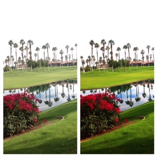
For the picture on the right, I increased the saturation so that the green of the golf course really stands out. It was a bit dull before, so increasing the saturation really made the green pop. I really enjoy this perspective because of the reflection of the palm trees in the lake. This picture is full of color and is a very pretty scene.
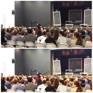
I increased the brightness in this photo so that it was more clear. This picture wasn't that great to begin with, so it was kind of hard to edit this a good way. In the bottom photo I increased the clarity so that the colors of the students clothes stood out more, instead of blending in.
Third Trimester
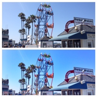
I really love both of these photos, even though I edited the bottom one. This photo, to me, holds a sense of fun and it has a summer feel. I definitely increased the saturation and clarification so that the blue sky and the ferris wheel stand out. I took this photo at Balboa Island so it is very fun and a happy photo.
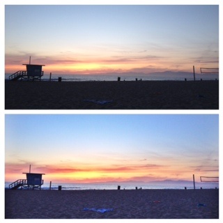
I feel like these photos also capture the beauty of Manhattan Beach. The photo on the bottom has increased brightness and saturation. I increased the brightness since I took the picture at sunset so there was not a lot of good light. The increased saturation helped to bring the colors in the sunset which is very nice.
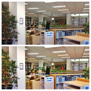
This picture of the library was taken as a student life photo, but I actually really enjoy the perspective of this photo. For the bottom photo I increased clarity, saturation, and brightness. By increasing the clarity and saturation of the photo, the colors were made to be more vibrant and are able to pop more. The brightness just made it easier to see and more clear.
